Portico
Strategic UX redesign for a unified student lifecycle platform — consolidating fragmented EdTech tools into a seamless, single-app experience.
Portico is an integrated EdTech platform for career schools, bringing together Campus Ivy, CourseKey, and Verity IQ under one brand. It manages the entire student lifecycle: enrollment, financial aid, attendance, skills, and student success.
As Portico began selling as a true end-to-end solution, students were still navigating 4 web portals and 2 separate mobile apps. This engagement, led through This Waay Product Design Studio, focused on defining the ideal unified student experience and delivering tactical guidance for Portico's Q4 roadmap.
Goals
Define the Ideal Integrated Student Experience
Deliver a clear, opinionated vision for how the student experience should be structured — ensuring tools, features, and touchpoints work together as one unified journey from first login to academic completion.
Deliver Tactical Design Guidance for Q4
Provide actionable design guidance to unify specific areas of the student experience so that a new student starting a program with Portico in 2026 has a seamless single-app experience.
The Problem
Students and schools faced a fragmented, disconnected experience — creating confusion, reliance on support, and missed engagement opportunities.
Fragmented multi-app experience
Students navigate 4 web portals and 2 mobile apps for basic tasks — attendance, payments, skills, and messaging live in separate, disconnected systems.
No centralized engagement channel
Schools lack a reliable way to reach students on mobile. There is no consistent nudge mechanism to drive student action.
Invisible progress
Students can't easily track their educational journey. Attendance, grades, skills, and course plans are siloed with no unified view.
High reliance on training
Apps require significant upfront training. Users can't self-serve or navigate confidently without hand-holding, driving up support tickets.
Process
Discover
Weeks 1–2
Product demos and stakeholder context-gathering. Built a shared understanding of the platforms, user types, and existing pain points.
Define
Weeks 3–4
Heuristic evaluation across Trajecsys, SIS, CourseKey, and the Portico mobile app. Identified usability violations and friction patterns.
Create
Weeks 5–7
Design concept generation — visual concepts highlighting opportunities and alternative approaches aligned to Q4 execution priorities.
Validate
Week 8
Results readout with the cross-functional product team. Aligned on north star direction and immediate tactical next steps.
Key Findings
A heuristic evaluation across 6 platforms surfaced recurring patterns across the three investigation areas.
No onboarding bridge
There is no in-product path connecting registration to the native app. Students complete registration but receive no prompt to download or set up the mobile experience.
Empty states offer no direction
When not yet enrolled, screens show empty states with no context — leaving students stranded with nothing to do.
Unnecessarily long enrollment flow
Trajecsys' email validation requires 5 steps and heavy admin intervention, with no self-service resolution path.
Clock-in flow lacks feedback
After selecting a site and clicking Clock IN, no confirmation is shown — a critical failure for attendance tracking.
Navigation lacks scannability
The passport surface carries too many responsibilities. It's not immediately clear what's clickable or what each element does.
Skills are invisible in core flows
The SIS mobile experience covers many service entities but skill logging is entirely absent — a major gap given it's one of the three core user stories.
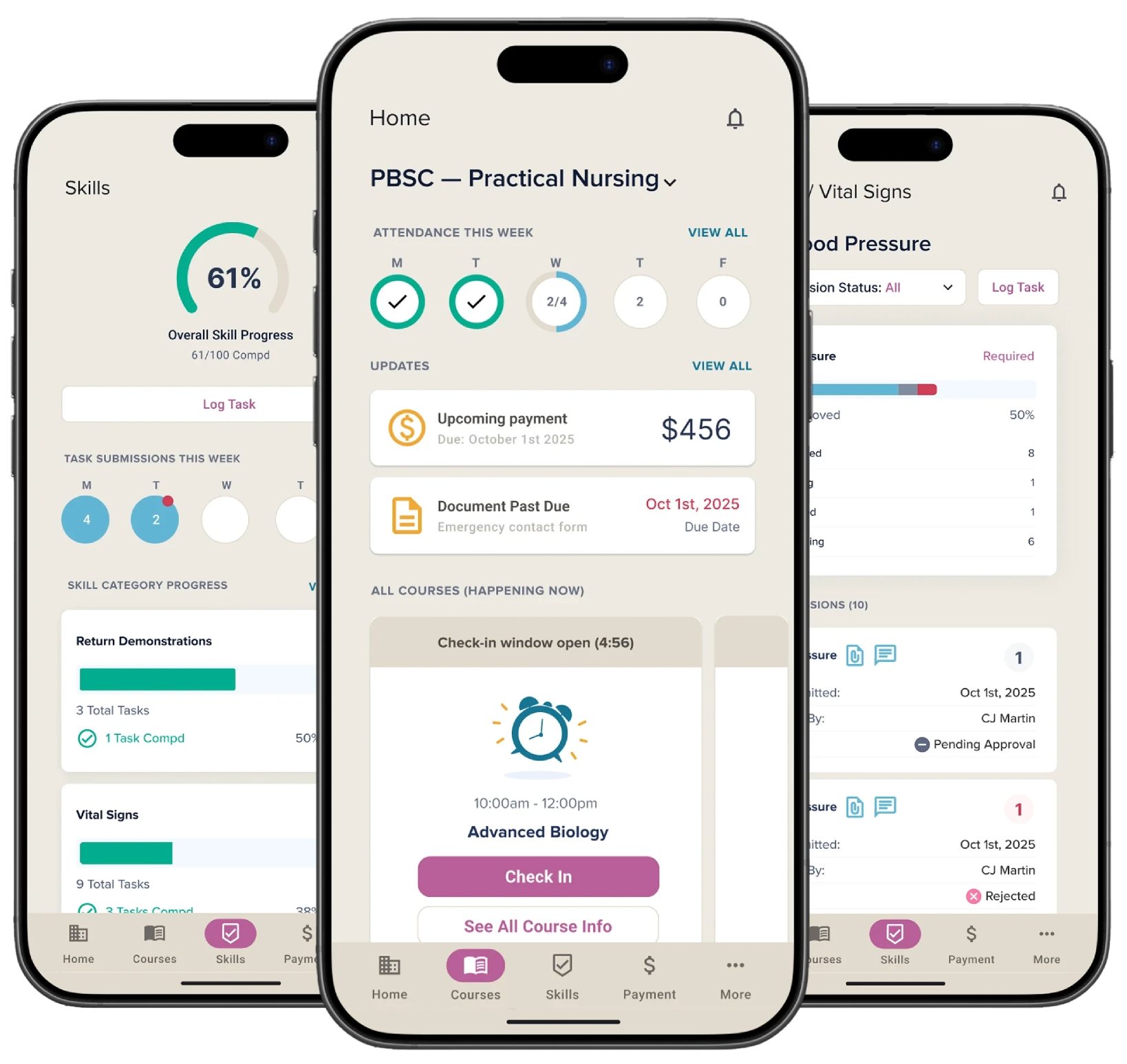
Design Concepts
Three concept screens were developed during the Create phase to address the highest-priority findings and demonstrate what a unified student experience could look like in Q4.
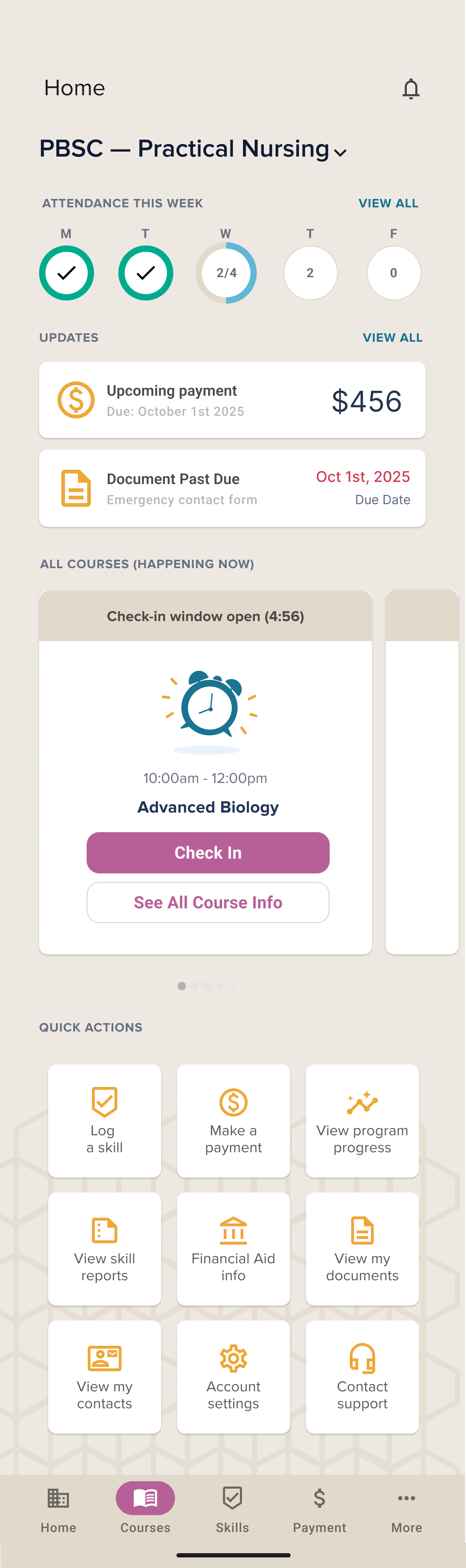
A unified home surface
Attendance, updates, payments, and quick actions consolidated into a single home screen — replacing the need to switch between 4 portals. Progress is visible at a glance from day one.
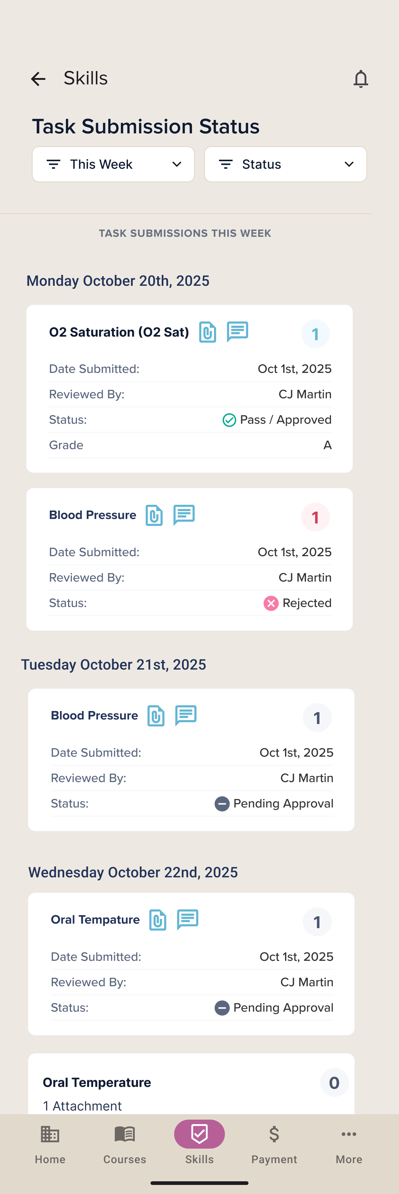
Skills made visible
Skill submissions, review statuses, and instructor feedback brought into the core app — addressing the complete absence of skill logging in the existing mobile experience.
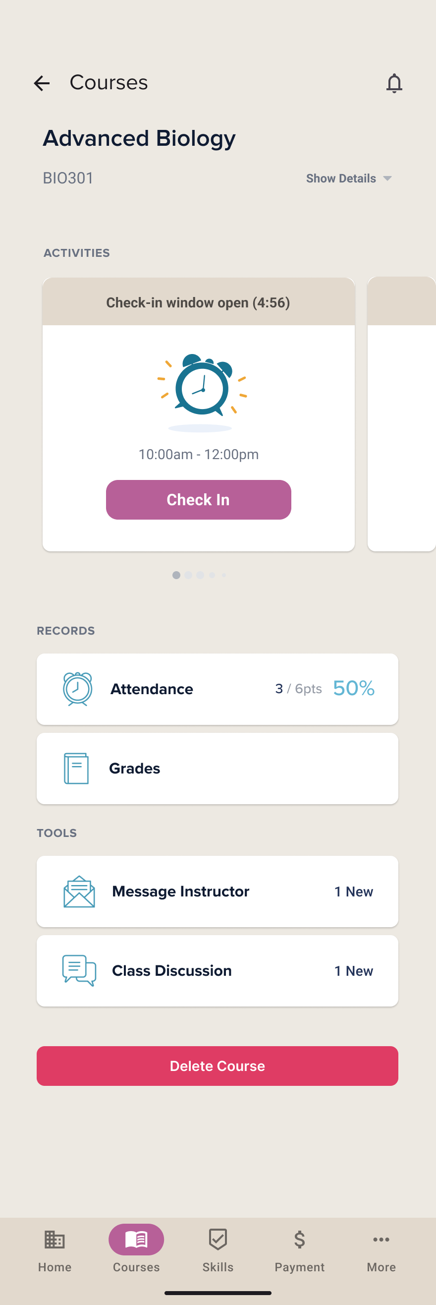
Course detail with records and tools
Attendance records, grades, and in-context tools surfaced within a single course view — reducing reliance on separate portals for each service entity.