Mermory
Designing a mobile learning platform that guides learners through progress, completion, and transition — human first.
What is Mermory?
Mermory is a mobile learning platform built around the idea that learning should feel like progress, not pressure. It combines structured lessons with moments of celebration — rewarding learners at every step of their journey.
My role spanned the full product — from defining the core learning experience to establishing a visual language that could scale across the entire app.
Problem
Learning apps often front-load complexity and fail to emotionally engage learners. Drop-off rates are high because users never feel a sense of momentum — there's no signal that they're making progress.
Solution
Design an experience where every interaction — from completing a lesson to earning a streak — reinforces the learner's identity as someone who is growing. Empathy at every touchpoint.
Goals
Guide learners through momentum
Use interface storytelling to make progress visible and meaningful — not just a number, but a feeling.
Reduce friction at critical drop-off points
Identify where learners abandon sessions and design micro-interactions that pull them forward.
Establish a scalable visual language
Build a design system that could grow with the product — consistent, warm, and human.
Here's how those decisions come together
across the learning experience.
Discovery
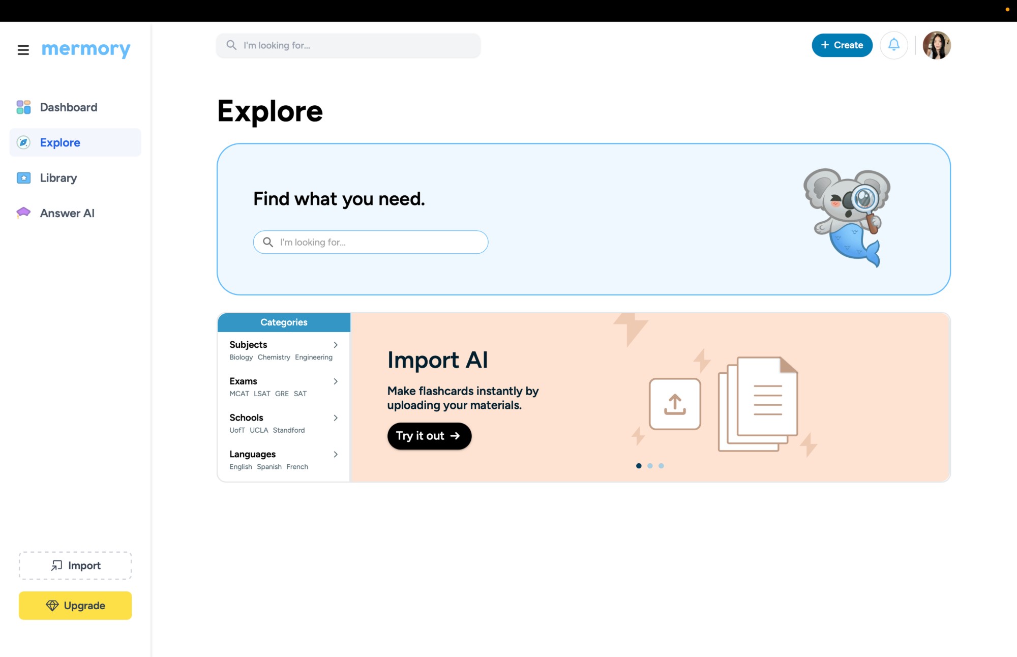
Learners arrive with a goal — studying for an exam, picking up a language, reviewing coursework. The Explore page was designed as their first meaningful moment of orientation: browse curated categories, search for decks, or skip the library entirely with Import AI, which turns any uploaded document into a ready-to-study deck in seconds.
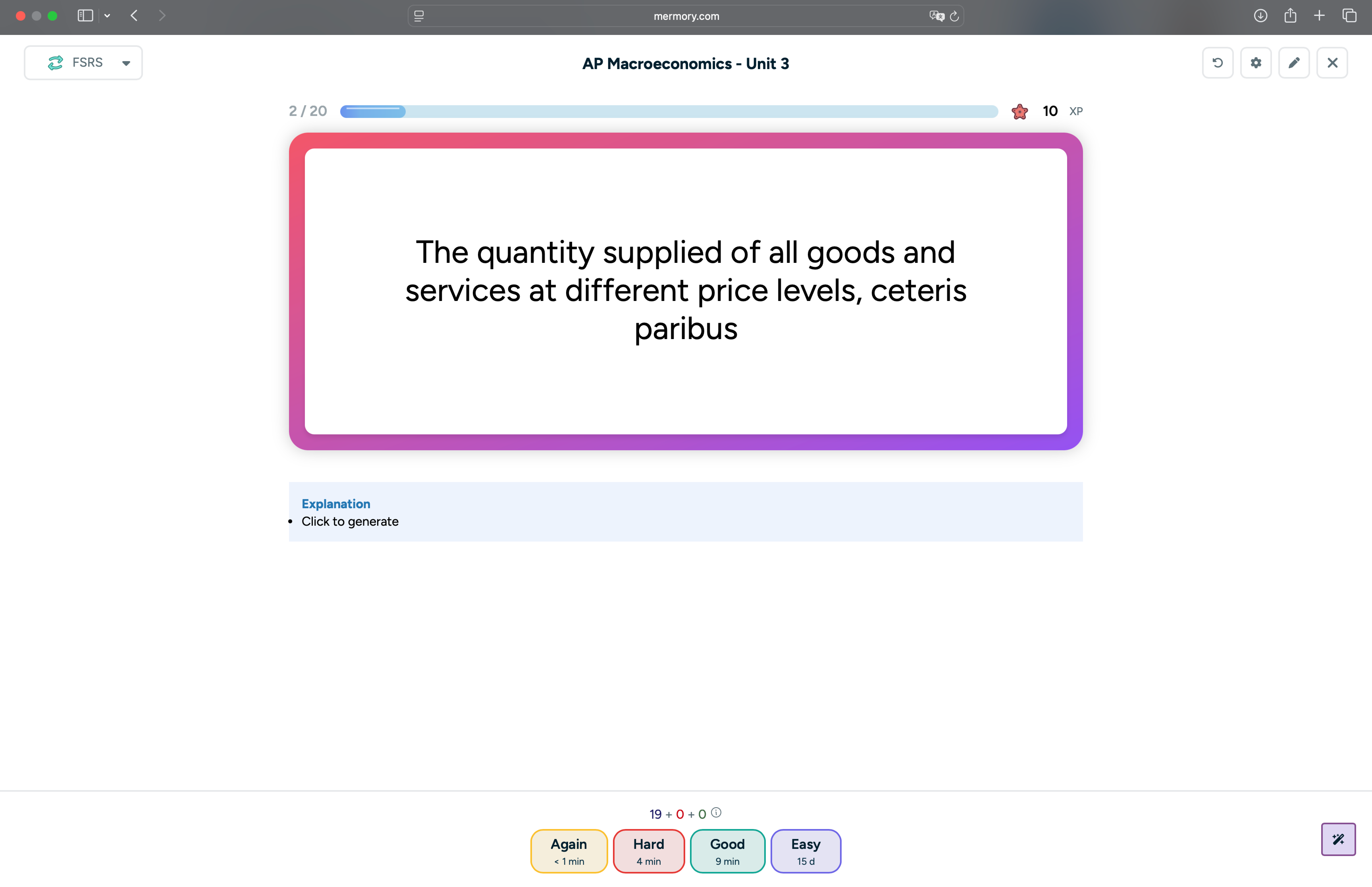
The Study Loop
The study session is where the product earns its keep. Each card sits inside a gradient-bordered canvas — a deliberate visual cue that this is a moment of active focus. FSRS schedules every card at the optimal interval; XP rewards and a live progress bar make sure each session feels like forward motion, not just repetition.
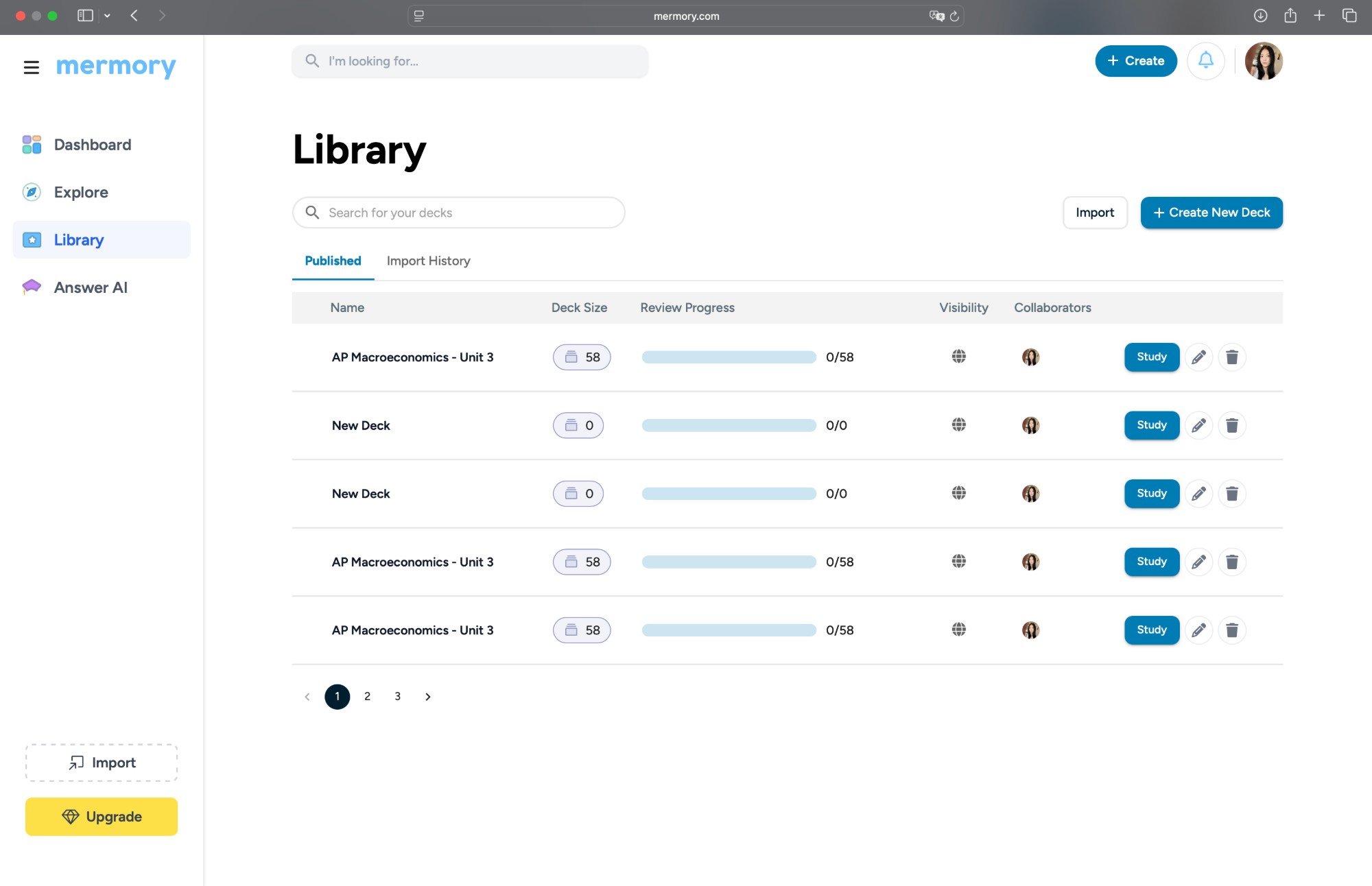
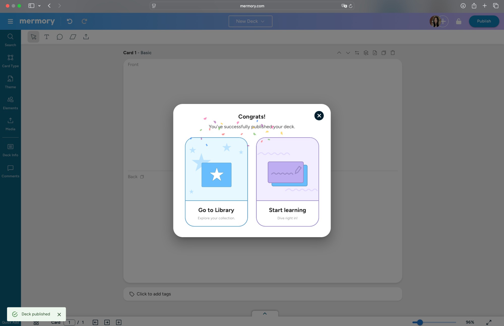
The Library tracks deck-level progress at a glance. Every publish moment is marked with a confetti modal — a small, intentional celebration that reinforces the learner's identity as someone who creates, not just consumes.
Visual Language
The gradient system, the koala mascot, the card animations — every visual decision was made to feel warm and alive without being distracting. This recording shows the design language in motion across the full product.