JAMS Scheduler
Strategic UX improvements for an enterprise workload automation platform — modernizing the experience without a foundational rebuild.
JAMS is an enterprise workload automation platform used by IT teams across industries — from financial services to healthcare — to schedule, orchestrate, and monitor critical business jobs across Windows, Linux, and UNIX environments.
This was a strategic UX engagement focused on modernizing the JAMS web client. The goal: identify friction points, surface quick wins, and deliver design concepts that demonstrate the opportunity — without requiring a foundational rebuild.
Goals
Deliver a modern, trustworthy UX
Refresh key interface patterns to reflect a contemporary experience — ensuring the design system, hierarchy, and workflows are cohesive and intuitive.
Reduce friction in critical workflows
Study how administrators and automation engineers perform key tasks to identify usability issues and reveal opportunities beyond a simple facelift.
Who uses JAMS
Business User
The Developer
Designs and builds job logic that powers business automation. Focused on creating repeatable, efficient workflows that remove manual steps for other teams.
Operator
The Babysitter
Monitors job execution day-to-day. Quickly investigates and resolves failed or unexpected runs to keep business operations on track.
Admin
IT / System Admin
Maintains the infrastructure and permissions that keep JAMS stable and secure — configuring servers, agents, and access controls.
Key Findings
A heuristic evaluation across the Monitor, Jobs, and Home pages surfaced recurring patterns of friction.
No system-wide overview
The homepage offers no insight into job health, agent status, or recent activity. Users land with nothing actionable.
Hard to find jobs
Heavy dependence on folder structure with no saved filters, search, or quick access to failed jobs.
Unclear error messages
Error logs lack hierarchy and guidance. Users can't quickly identify what broke or how to fix it without hunting through multiple screens.
Configuration paralysis
Job creation exposes 60+ job types with no filtering or context — overwhelming for new and non-technical users.
Inconsistent interaction patterns
Pagination defaults to 10, action columns hide off-screen, and global vs. item-level actions are grouped — creating confusion.
Mixed read/edit experiences
Editable and read-only pages share the same visual treatment, giving no indication of what's actionable.
Starting Point
The original web client — functional, but offering little visibility or guidance to the people who need it most.
Users land on a near-empty page — no system status, no job health overview, no way to jump into work. A missed opportunity to orient operators the moment they open the app.
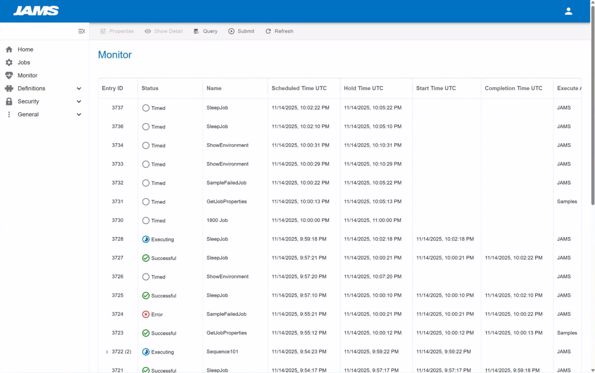
A dense, unfiltered table with no summary context, no status-at-a-glance, and actions buried off-screen. Operators had to scroll, hunt, and guess.
Design Recommendations
High-value changes that respect the existing information architecture — a phased approach to improvement.
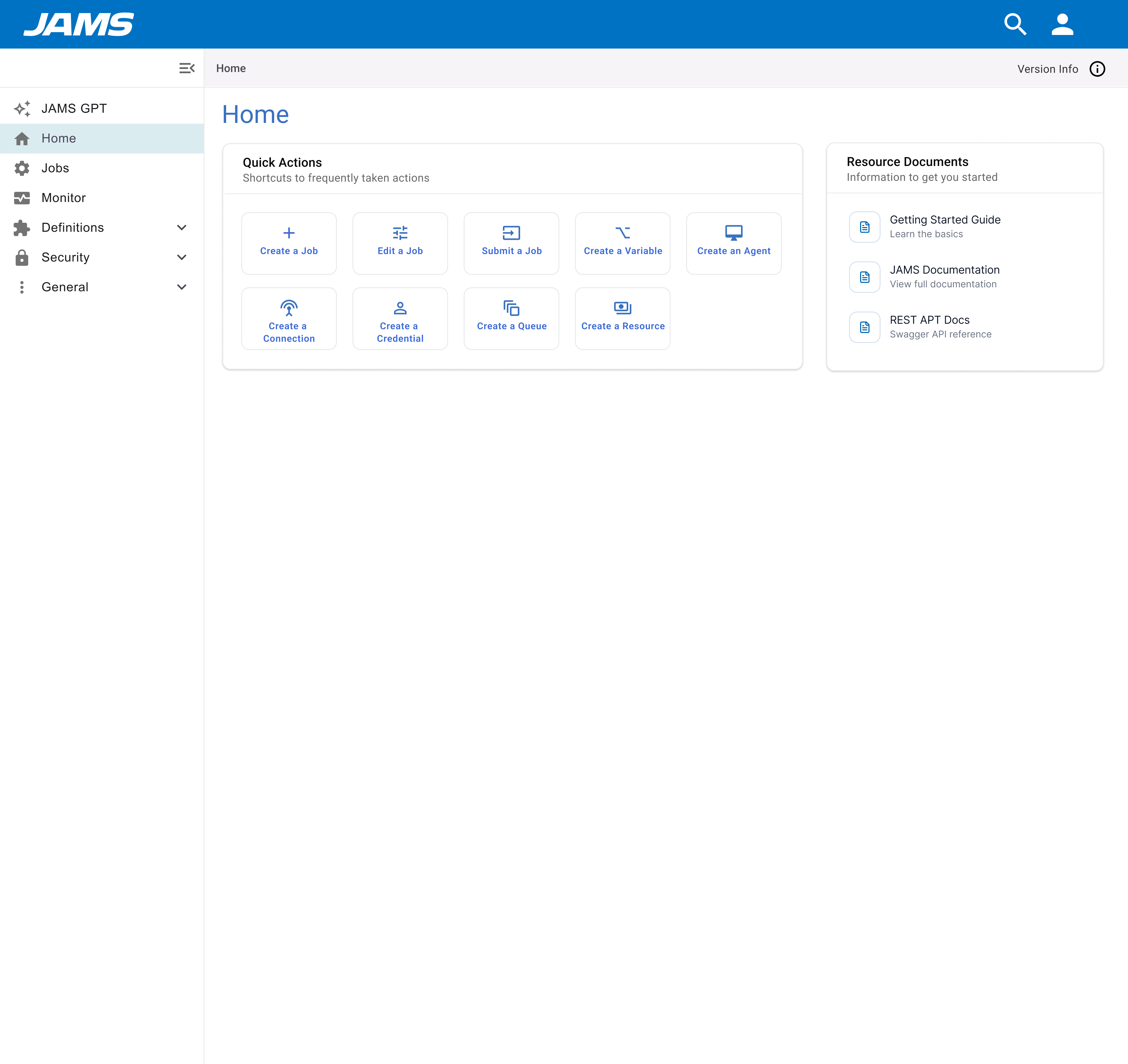
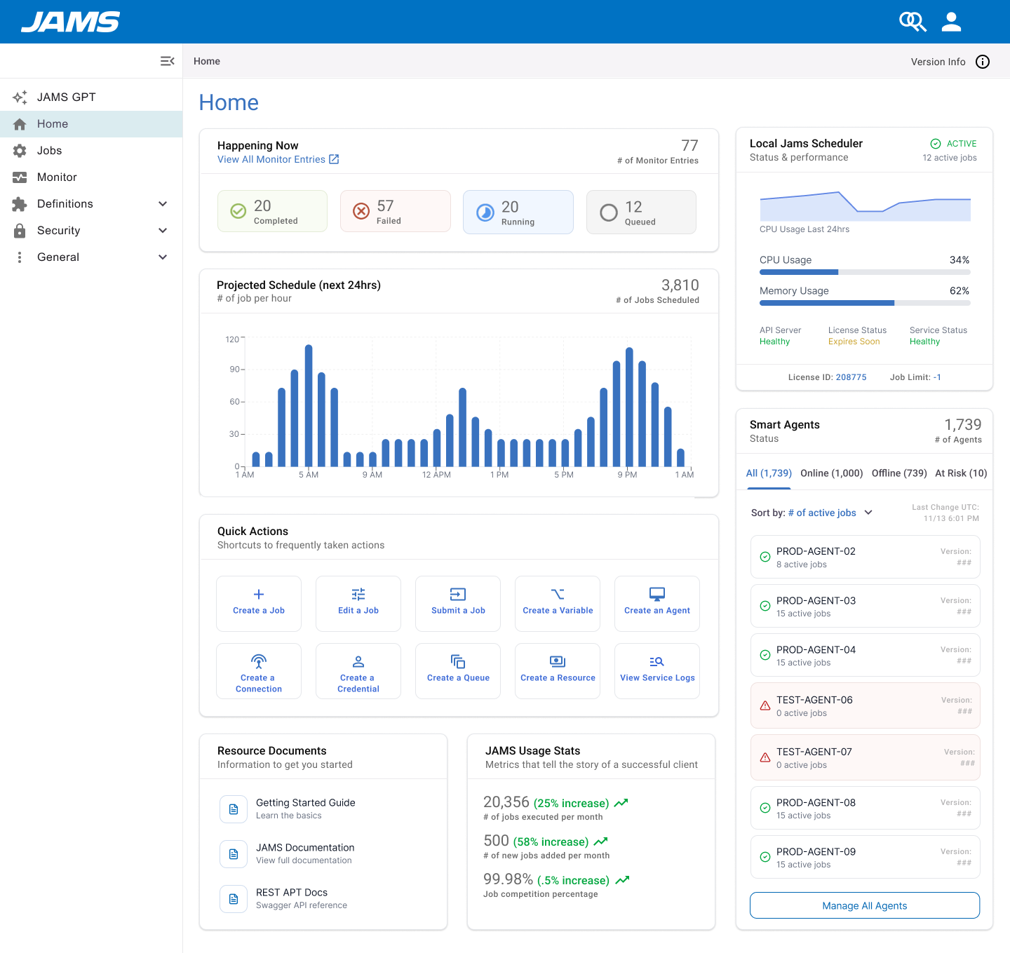
Home / Landing Page
Transform into a unified jumping-off point with system-wide status, agent health, job history, and at-a-glance insight.
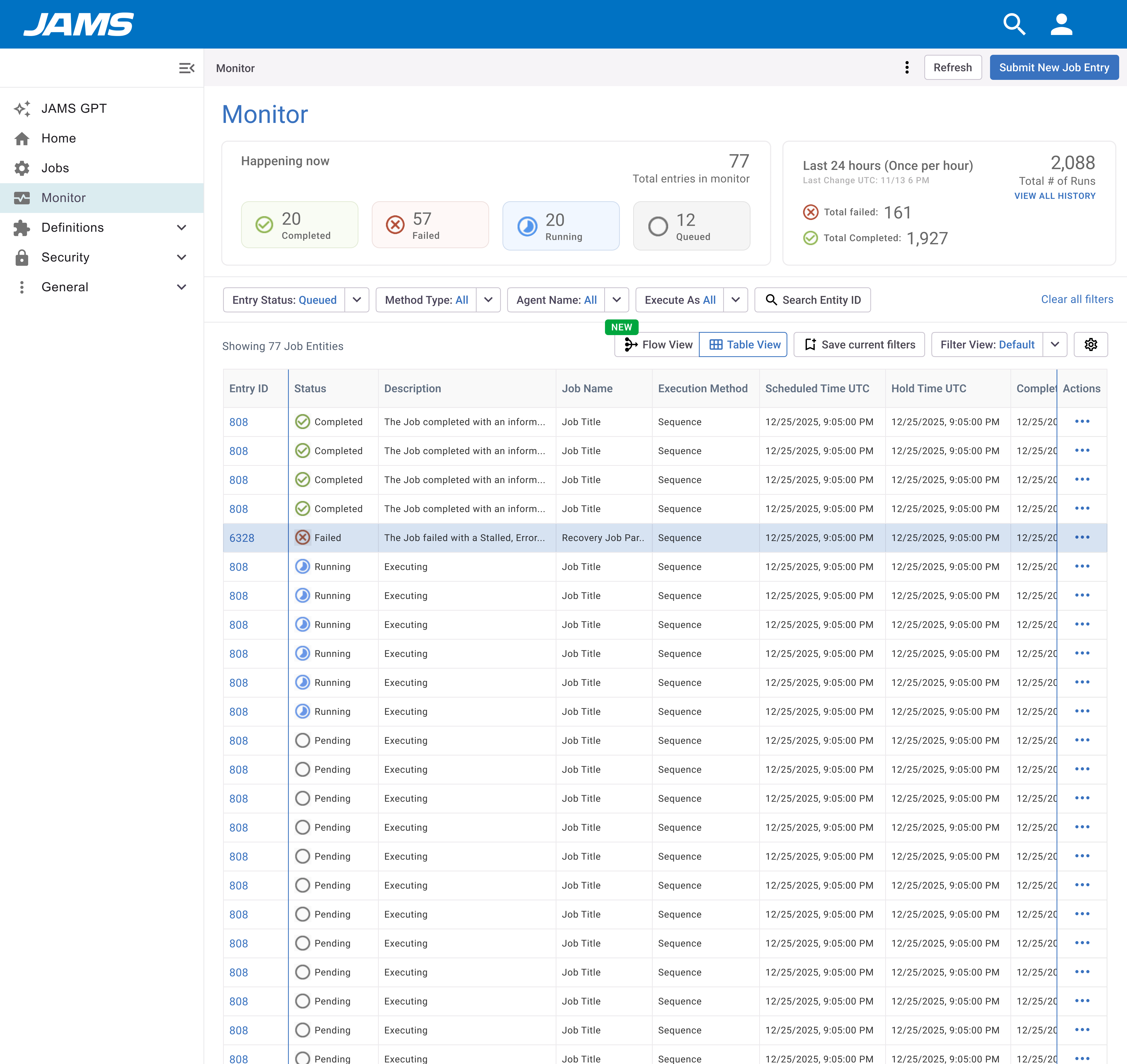
Monitor Page
Improve scannability with better status visibility, persistent pagination, accessible action columns, and quick filters for failed jobs.
Job Entry / Log View
Surface error context, recommended next steps, and direct links — helping operators resolve issues faster.
Jobs Landing
Improve findability with saved filters, quick search, and smarter default sort orders.
Job Creation Flow
Introduce execution-method-based guidance and AI-assisted creation to reduce option paralysis.
Job Details: Summary
Replace the flat summary with meaningful context: last run, next run, failure rate, and job type at a glance.
The Redesign
Three iterations of the home page, and a ground-up rethink of the monitor. Each pass tightened hierarchy and surfaced what operators actually need — without losing the power-user depth that enterprise teams depend on.
Home Page
From a blank landing page to a real-time operations hub. Three versions, progressively simplifying the information architecture to reduce cognitive load.
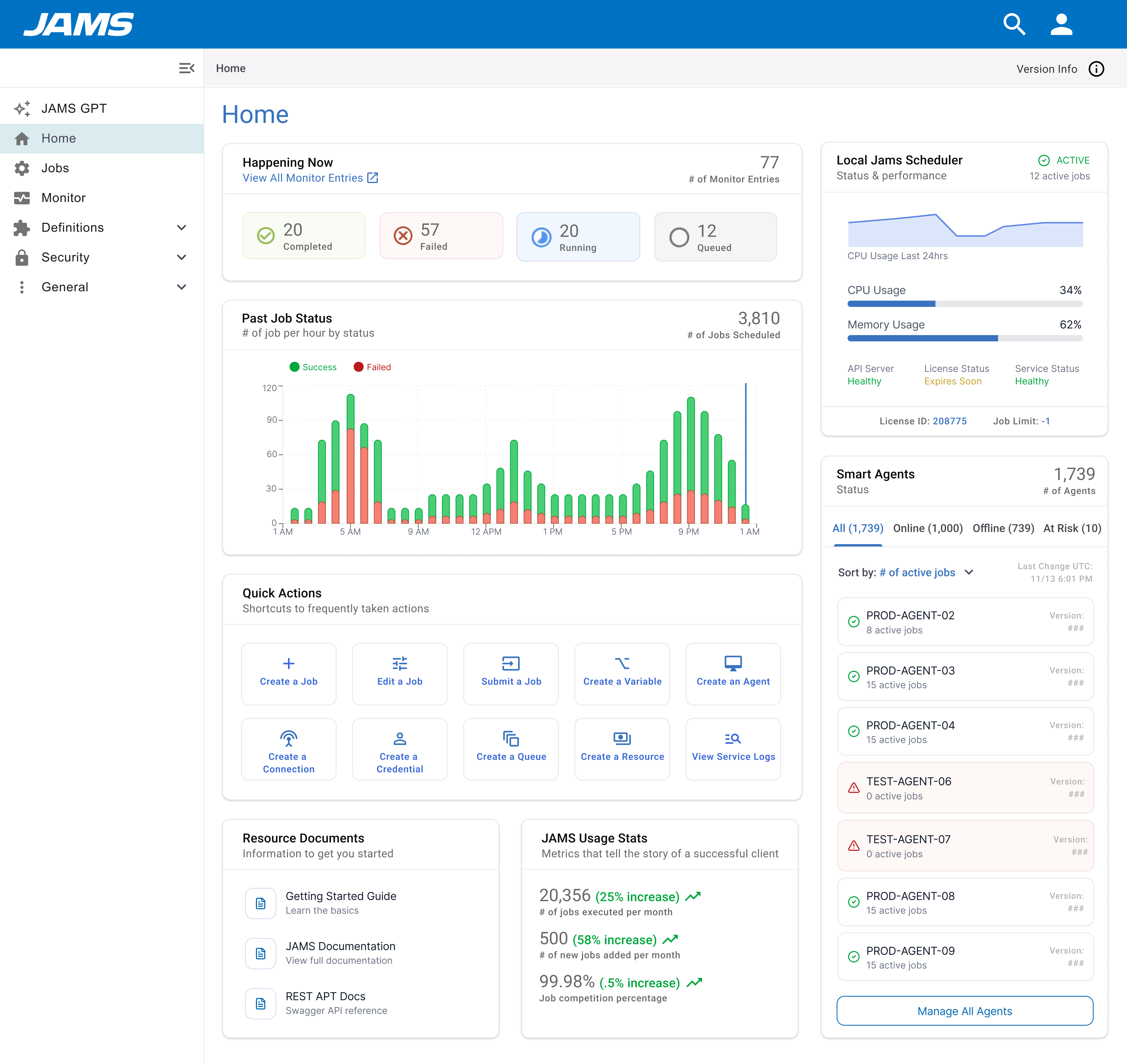
Monitor Page
Added a stats header for immediate situational awareness, smart filters to surface failures fast, and persistent pagination so operators don't lose their place.